Last month, we brought you the first in our new series of printed packaging design inspo that takes functionality to a whole new level.
You can see the first post here; it was all about a Swedish brand making eating wraps on the go easier than ever before.
Sticking with the food theme – and the Swedish one, actually – today we’re looking at a fab design we found on Pinterest that could revolutionise the way we eat donuts forever. Yes, you heard us right – donuts.
*Cue Homer Simpson impression*
We’ve all been there. You’re tucking into a tasty donut, with rainbow sprinkles if you’re feeling daring, and the trauma of eating it almost (but not quite) eclipses the joy of tasting it. You’re sticky, your mouth is sticky, your hands are sticky – eating donuts is messy.
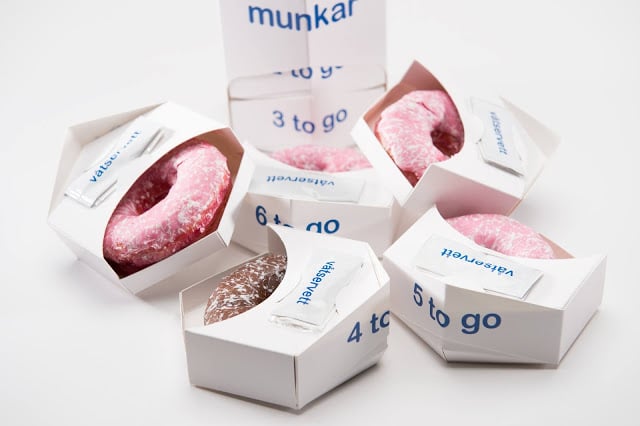
But this student project, designed for a fictional donut shop called 8munkar, changes all of this!
The donut packaging design you see below uses several ingenious ways to make consuming these calorific delights all the more enjoyable.
For a start, the packaging itself saves space by being long and thin, making it much easier to carry. Second, each of the donuts in the pack of eight are individually packaged within the tube, meaning no dreaded icing transfer and an all round cleaner experience. As you open it from the bottom and your dreamy donut is dispensed, the text on the packaging even tells you how many tasty treats you have left! Genius. And, each individual donut has a napkin attached to it so you can clean up effortlessly after eating. They’ve literally thought of everything.
We want to see more of these innovative functional packaging ideas on the high street, in our homes, and in restaurants.
Have you spotted any ingenious packaging ideas recently? Tweet us a picture to @printedbagshop, we’d love to see them!
(All images from Pinterest / this packagingoftheworld.com article)


