The possibilites with printed packaging are endless.
Getting creative with how your products are packaged and presented to customers is a great way to leave a lasting impression, and see people return to your brand again and again.
As design and branding develops and new trend start to emerge, it’s fascinating to see how companies use printed packaging to set themselves apart and stand out from the crowd.
One way to really make an impact with printed packaging is to make it functional, to give it a purpose, to make something that helps make your customers lives easier in some way.
We’ve been going pin-crazy over on our Pinterest, and found some fab examples of really well thought out (and beautifully designed) functional packaging, and thought we’d share them with you here!
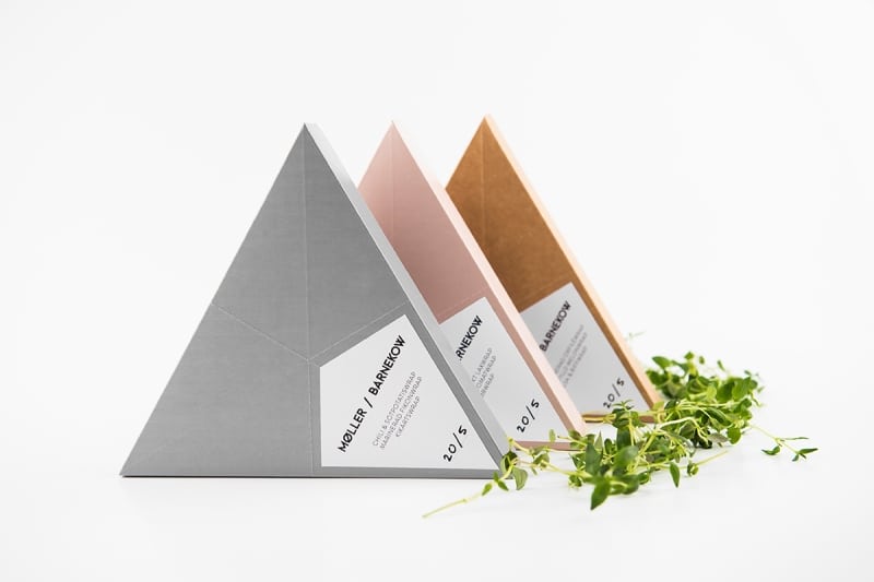
Here’s the first in our favourite functional packaging series – a quirky sandwich design from Swedish brand Moller / Barnakow.
You know how annoying it is when you open a packet of sandwiches and they’re really awkward to get out, leaving your sandwich a mess and still half in the wrapper? This design tackles that with a triangular shape that splits off, giving you three distinct sections to store sandwiches or wraps.
No fuss, no mess, and some seriously stylish pastel packaging too, that’s perfect for giving a high end feel to eating on the go. Moller/ Barnakow, take a bow.
All images found on Pinterest, and are from aldenchong.com.


