Five Big Design Trends for 2017
If you’re looking to launch a fresh new brand in 2017, or just give your existing one a makeover, you will be keen to know the latest design trends emerging from the world of graphic design and packaging that will be influencing the styles of branding we see develop this year!
We’ve had a good root round, done some research, and think we’ve narrowed it down to 5 big design trends for 2017 that seem to keep cropping up.
The use of negative space
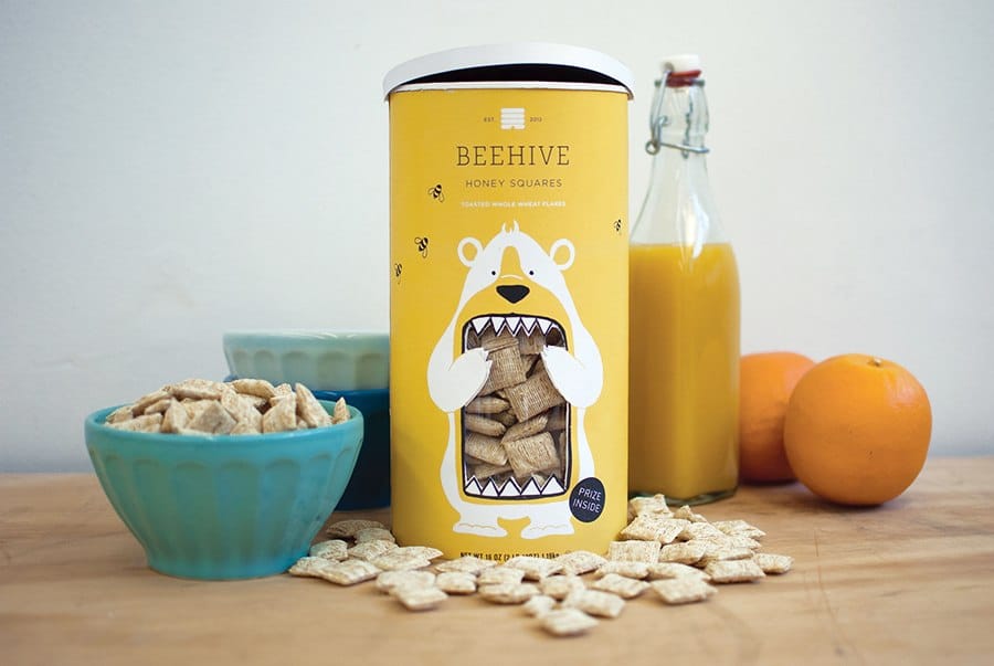
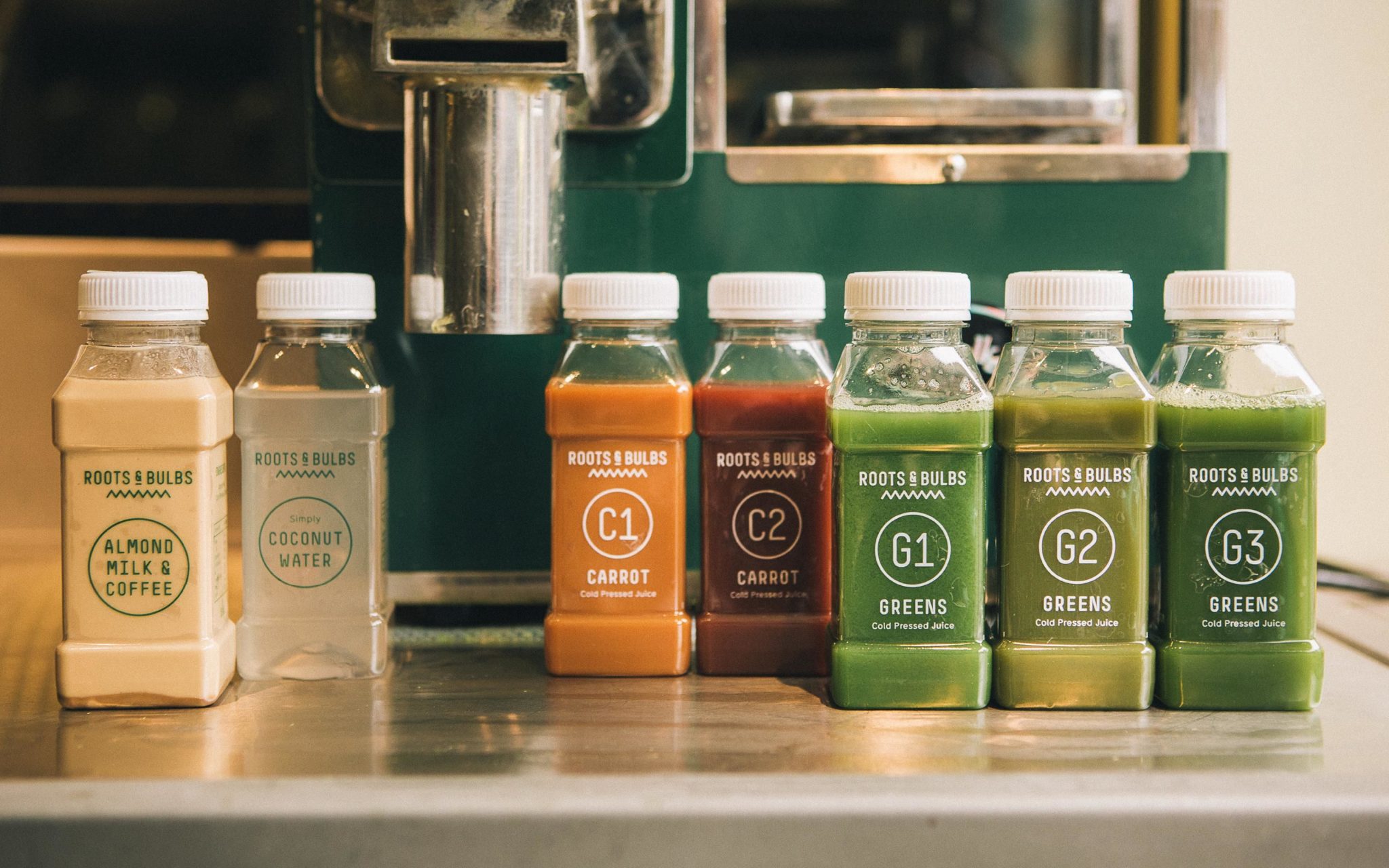
Don’t tell the others, but we think this one is our favourite!
The reason that the use of negative space in packaging, especially food packaging, is becoming so popular, is because people often want to see what’s inside the bottle or carton before purchasing, to get an idea of it’s quality and exactly what they’re getting for their money.
There’s also a love of all things ‘natural’ recently, and showing off a product as it actually is, rather than being hidden inside a label, gives this effect really well.
You can either keep it simple with this trend by going almost completely bare, as the Roots and Bulb brand has done with their beautifully colourful drinks – or, to give a more tongue in cheek approach, you can use cut outs of negative space in your packaging to create something more novelty and playful, like the Beehive example.
This trend is really versatile, and comes down to using your product itself in it’s natural form to help your brand stand out.
Hand drawn illustration to tell a story…
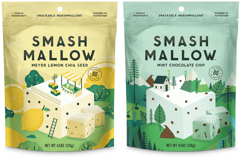
Seeing glimpses of a brand’s personality is a key thing to help persuade us to buy, and to make a design stand out on a shelf, and the rise in hand drawn illustrations and storytelling on our packaging reflects this.
When a brand’s imagery looks hand drawn, it feels more unique and personal, and it gives the brand more character, helping customers feel a better connection the brand and therefore more inclined to buy. It also really helps to tell the brand’s story in an innovative and attractive way.
…and custom, handwritten lettering

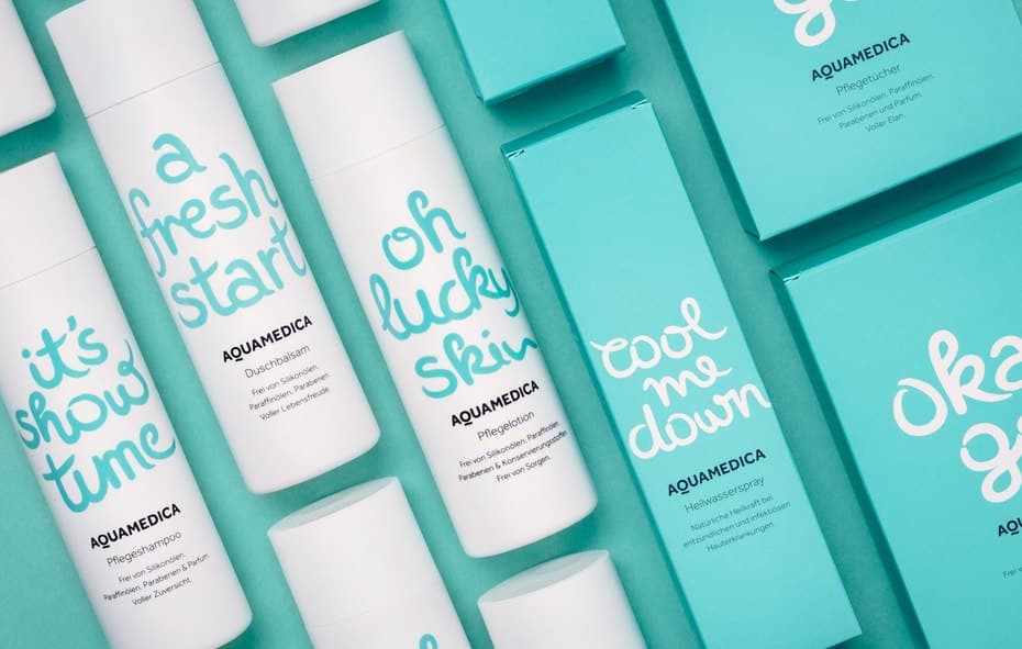
Following on from the previous trend, it’s not just drawings that are being given the handmade feel, but lettering and font design too. More than ever before we’re seeing brands using fonts that imitate handwriting, like the above skincare example, to again give that personal touch and in an effort to create greater connections with customers.
2017 is definitely the year where brands try to get real, and feel more real and human through their branding and design choices.
Minimalism and clean, bold design
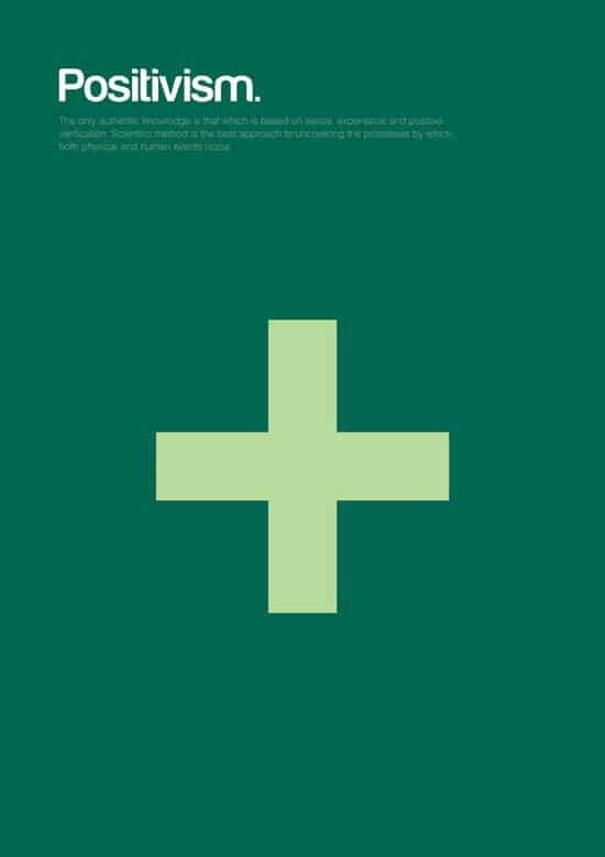
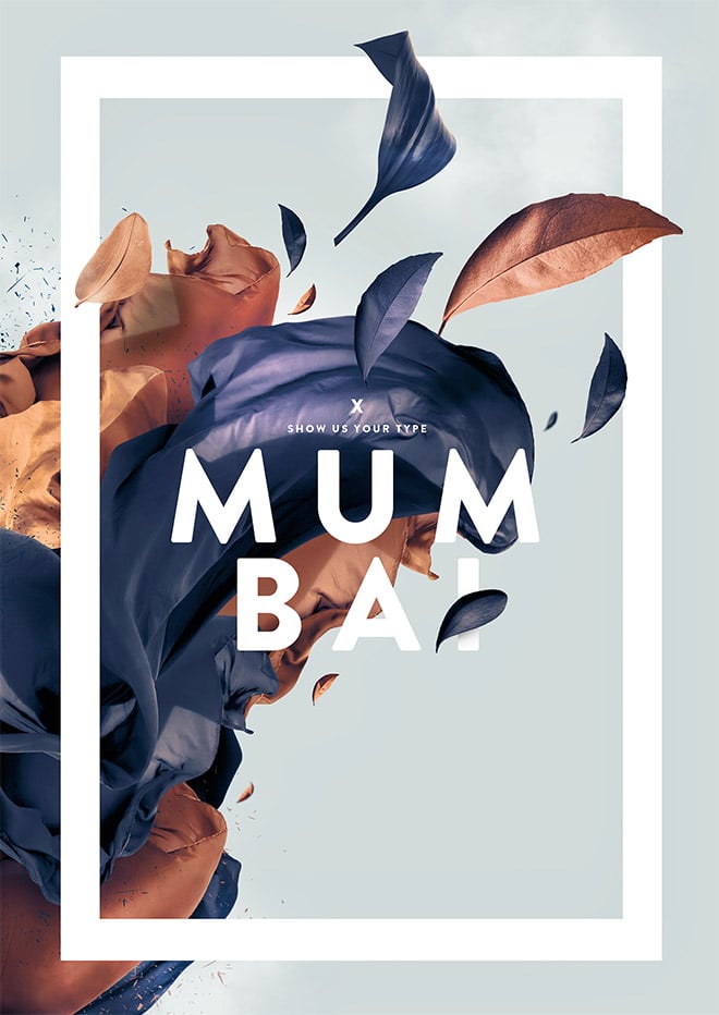
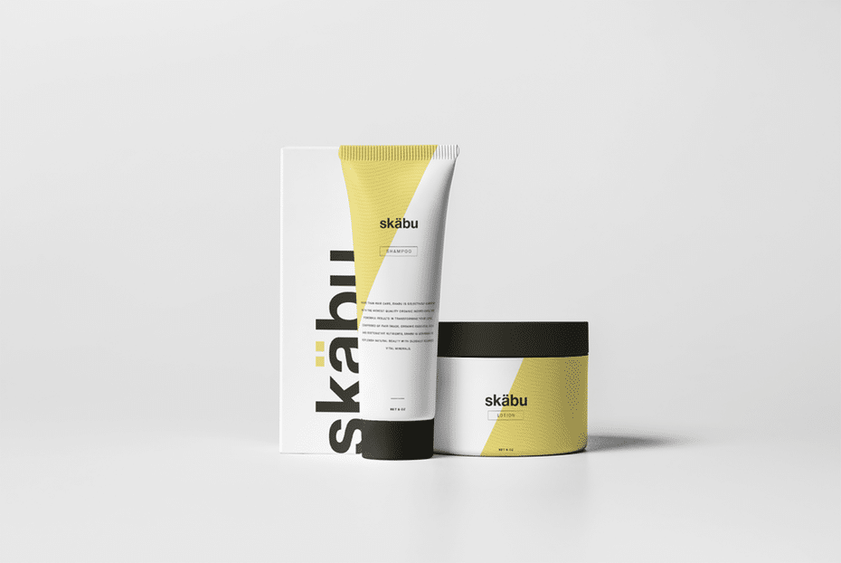
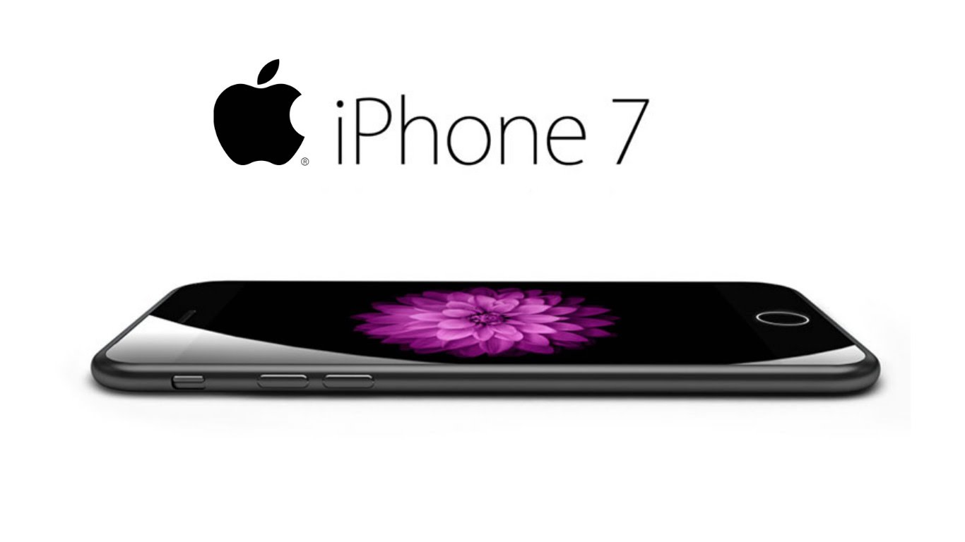
Minimalism is a big trend, and one that’s been developing for a long time. We’ve seen clean cut, bold design around for years, and it remains popular because it has such a high impact and enables brands to stand out, and in a time where our eyes are filled with so much white noise of advertising, a bold piece of design like those above can encourage us to stop and take note.
There’s lots of ways to embrace minimalism and incorporate it into your branding and marketing campaign – you can use close up and impactful photography, minimise the words used on your imagery, keep your range of colours to a very simplistic palette, and essentially just think about the core of what you’re trying to convey to your customers, and trim off all the excess stuff that we can’t help but include sometimes. It’s all about less is more!
Modern retro, with influences from original packaging styles
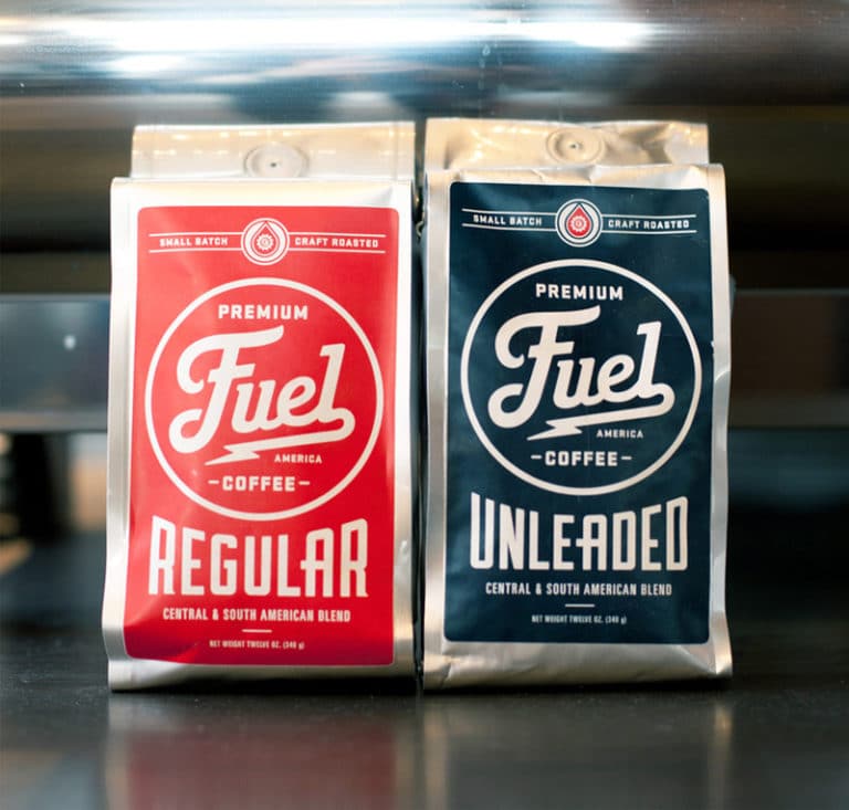
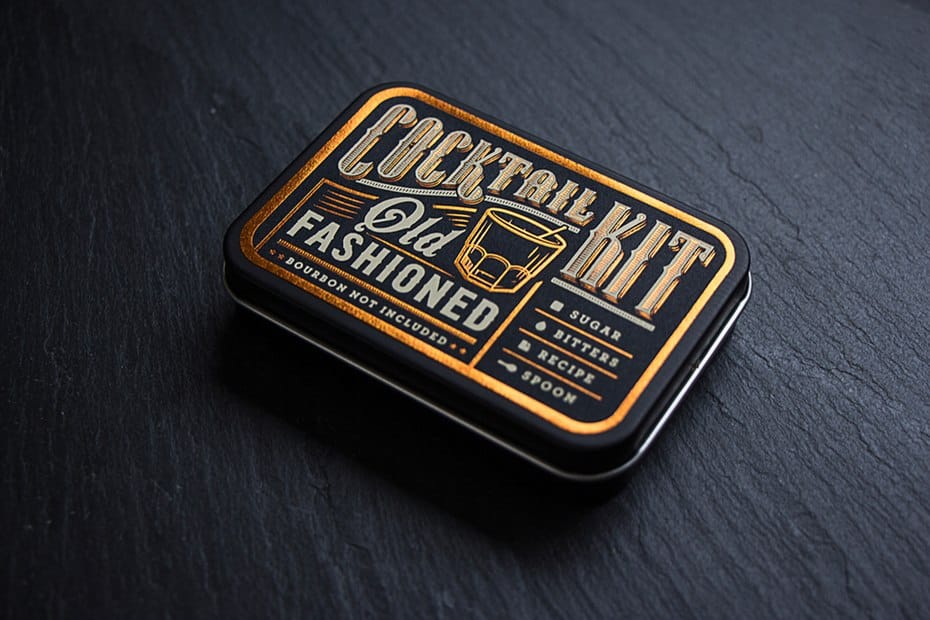
Again, the idea of taking inspiration from old fashioned packaging and giving it a modern twist is, unsurprisingly, nothing new – designers have been playing about with this concept for a long time. But, the popularity of it and the sense of nostalgia, tradition and longevity that it inspires in customers means it’s here to stay.
The idea is not to simply copy old school packaging and create something that literally looks like it’s from the 1930’s, but instead to take the core elements of retro packaging but add a modern twist, whether that’s through the use of bold or unusual colours, textures or shapes.
So there you have it! What’s your favourite?
If you’d like to bring any of these design trends to life by creating your very own custom printed bags or packaging, get in touch! Call 0191 268 7555 or email sales@theprintedbagshop.co.uk to request a price from us today.
References:


