An explanation of Spot Colour, CMYK and Gradient Printing
When you see print options of spot colour or process printing on promotional stuff like our printed bags, do you get a little confused as to what it all means?
Don’t worry, you’re not alone – which is why we’ve put together this little post giving an explanation of spot colour, process and gradient printing, the processes we use here at The Printed Bag Shop.
Spot Colours
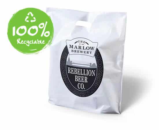
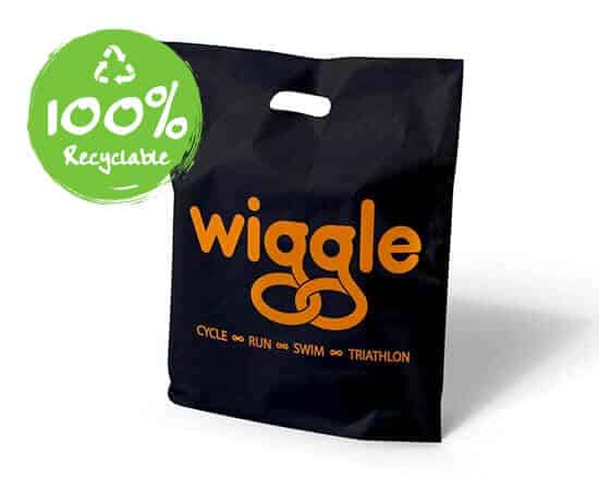
This term refers to colours which are created from a single ink. This can be a pure colour or one made up to a Pantone formula. Spot colours are solid colours created without screens or dots. Made from a palette of 18 basic colours, each of the spot colours in the Pantone Matching System is mixed to its unique formula developed by Pantone. Spot colour printing is most economical if you use no more than three colours. At The Printed Bag Shop we recommend using solid spot colours on plastic carrier bags like our printed vest carrier bag.
One advantage of spot colour printing is that your chosen colours will be more accurate because you selected a specific pantone number. For example Pantone 280 Blue will always be 280 Blue for every reprint. If metallic or fluorescent colours are part of your logo or design they can only be printed using spot colours.
A disadvantage to using spot colours for your designs is that they are almost impossible to replicate on digital printing devices.
Colour Process Printing
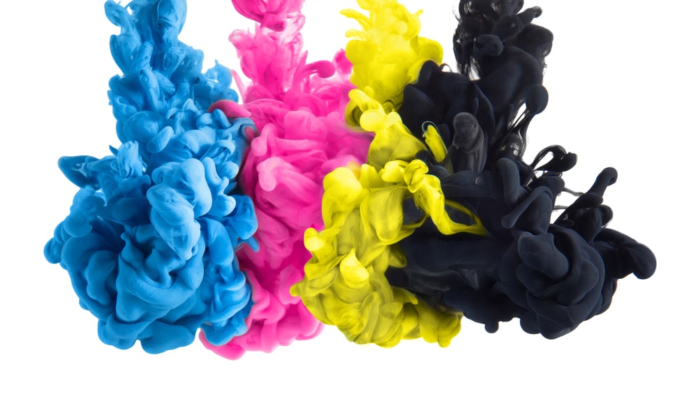
This process takes four basic colours; Cyan, Magenta, Yellow and Black, known as CMYK. It’s the combination of these four colour dots overlapped with other dots that produces the full colour spectrum. This process is the best option when printing photographic type images or graphics with lots of colour depth. It is definitely the best printing method to achieve realistic looking photos on printed products.
So how do they do it? A colour image is separated into the four colours, CMYK. During this separation screen tints comprised of small dots are applied at different angles to each of the four colours. The screened separations are then transferred to four different printing plates, one for each colour, and run on a printing press with one colour overprinting the next. The composite image fools the naked eye with the illusion of continuous tone. When printed the original image is recreated.
An advantage of colour process printing is that because process colours are represented as percentages of CMYK, these varying percentages offer thousands of colour possibilities meaning that you can have the most colour complex image or design you want.
As colour process printing is a mix of dots over other dots there is a possibility that the colour can change from job to job which can be a disadvantage in some cases.
Colour Gradients
This term is used to describe a gradual blend of colours or images from low to high values. Using colour gradients can create a softening effect on your design exactly where it is needed.
It is an intricate process that takes screen percentages across an object to create a blend of that colour. For example to blend an area of black to grey you will start with 100% of black, then over the distance of the area choose a smaller percentage of black that produces a gradient to the desired level of grey.
A little complex don’t you think? Which is where our experts at The Printed Bag Shop design and print department come in; they can take your design or logo and create amazing results on any of our range of printed bags.
The mystery of Spot Colour, Process and Gradient Printing revealed!
Now that you feel a little more informed on the different printing methods out there we hope it helps when you are throwing around ideas for your next promotional campaign image or design.
Still not sure of the printing method that will work best on our different bag options? Get in touch – we’d love to help!


