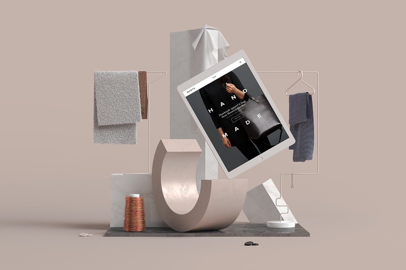
It’s looking like old is new again when it comes to design trends for 2018. While simple minimalist styles won’t disappear, graphic design trends from the past will put in an appearance again with some fresh modern twists.
If you’re looking to be ‘on trend’ with your branding, we’ve picked out some of the design trends for 2018 that can help you decide on the style for your company.
Responsive Logos
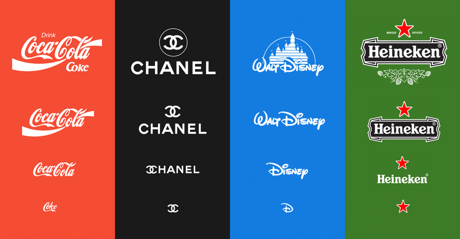
While companies are often updating their logo to remain instantly recognisable, yet in line with current trends, many still need to work on how their logo looks on all devices. The continuous increase in mobile browsing and the array of different devices and screen sizes means that without a responsive logo you run the risk of your image being less than impressive in mobile searches.
3D Designs
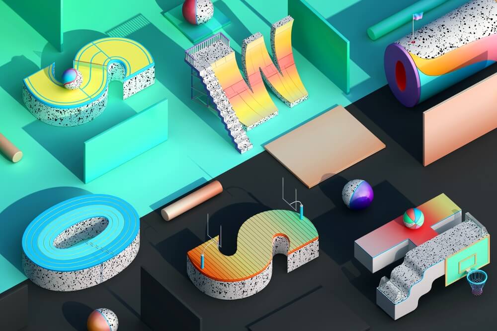
3D Design has been growing in popularity for a couple of years; it is set to be big business in 2018. Still life design saw an increase in 2017 and this trend is expected to increase in popularity. Creating a design with a combination of product placement and logos in this style can produce some pretty cool designs.
3D Typography will push creative boundaries. This is proving to be an effective way of connecting with and impressing your target audience.
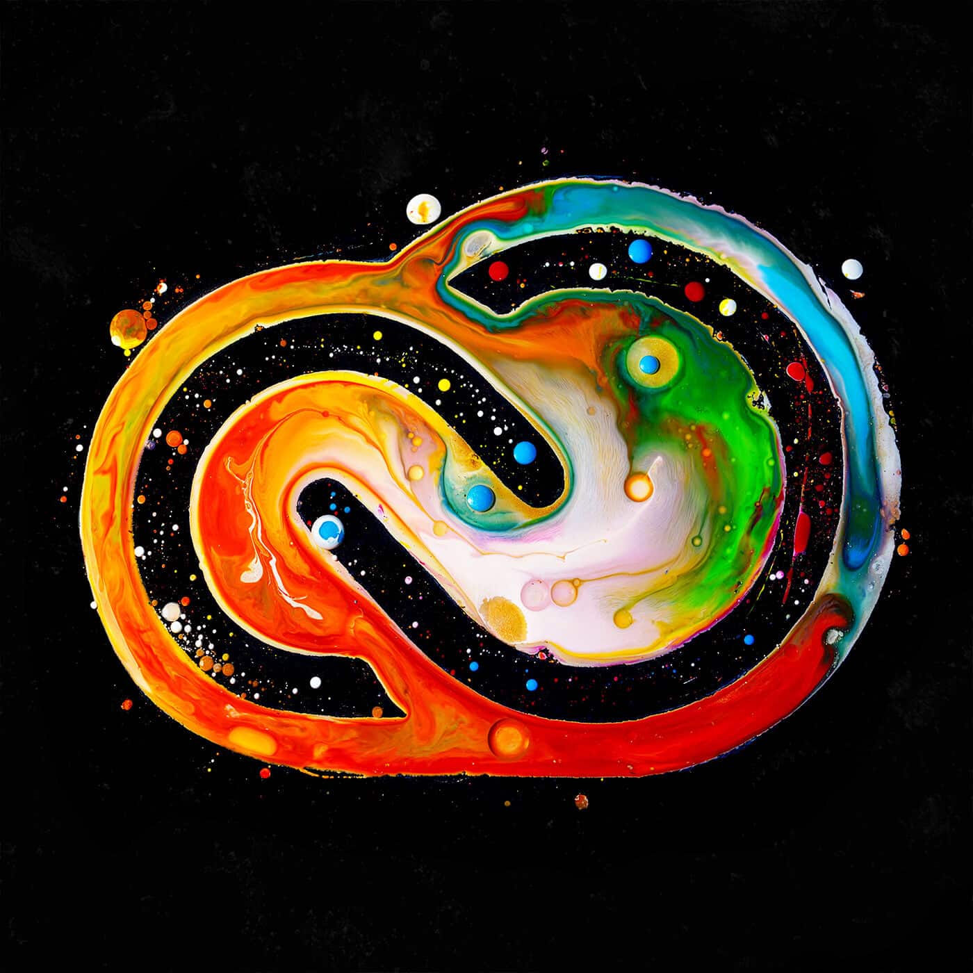
Flexible 3D Design; the cross-over between reality and fiction will become more blurred, possibly with an increase in natural forms like liquids and movements we will recognise mixed with animations. Theses will be super eye-catching designs for company branding messages.
Colour
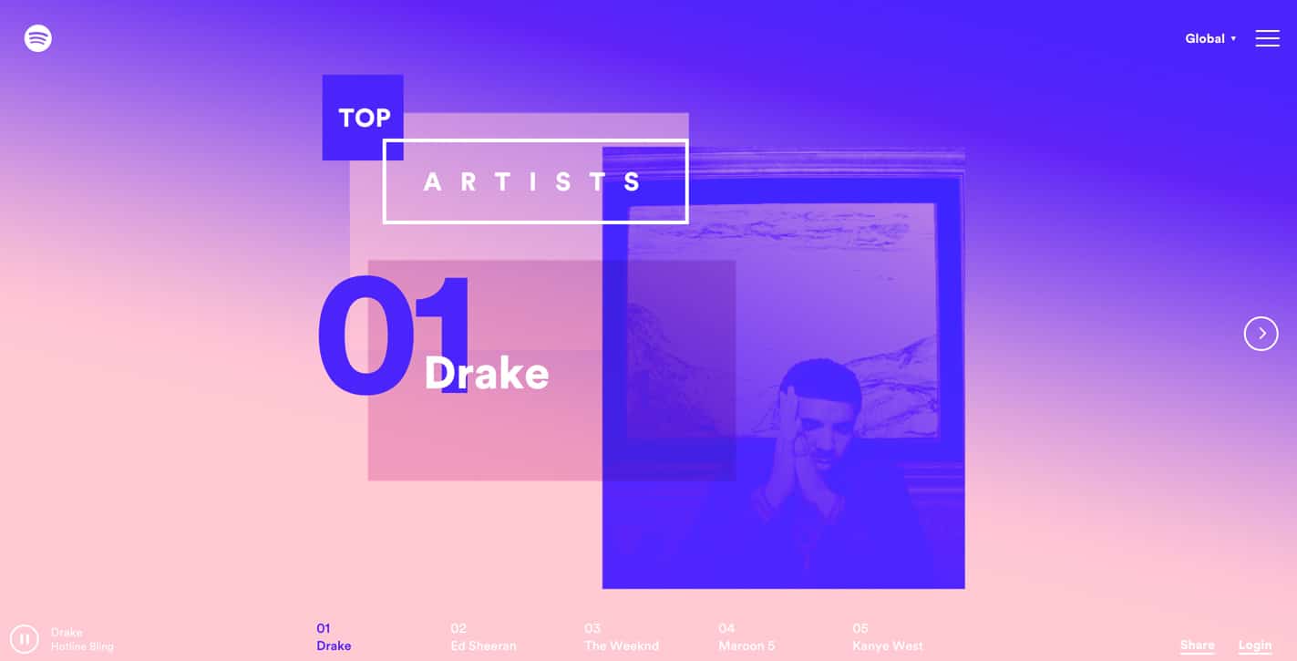
Like 80’s and 90’s nostalgia, colour gradients are making a comeback with lots of brands using bright vivid colours and a range of textures. Designers are using unconventional, risky colour choices, like this from Nutella, and vibrant colour schemes that companies will use as they grow rather than sticking to one colour. Like gradients, shadows are back this year too. Long shadows can add more dimension to a flat design.
Font
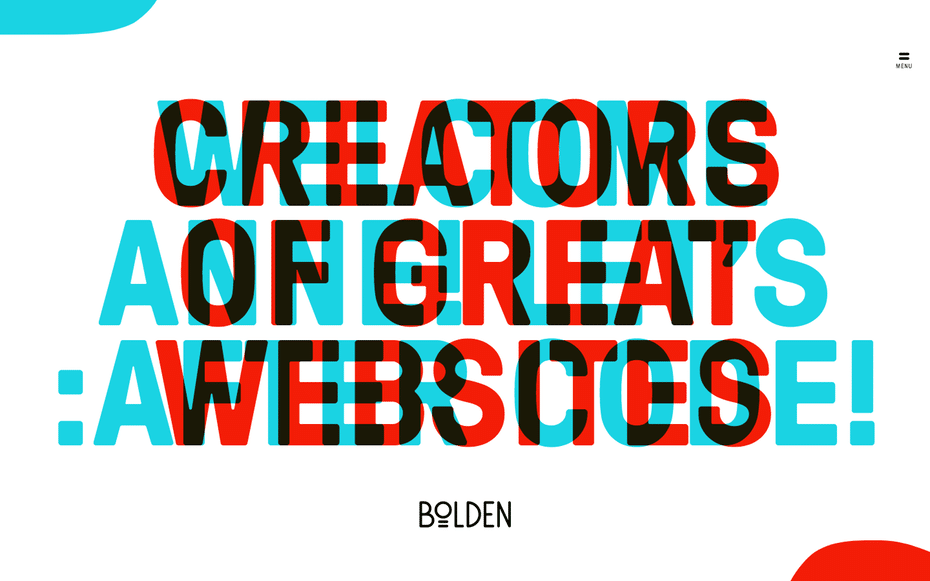
Minimalist fonts will be taking a back seat as bold and handwritten fonts are used to give unique eye-catching designs. Many companies are looking at their branding and ways to pack as much meaning into as few letters as possible; wanting to communicate their ethos and their message into a single word. A great example of this is ‘Bulb’, the energy provider. Simple and effective, this four letter word communicates their product and their purpose perfectly.
Using a single, bespoke font is a trend that’s catching on this year. Bespoke lettering will make a brand distinctive wherever it is seen, digitally or in the printed form, without cluttering up the design with unnecessary fluff. The new logo from Giraffe World Kitchen, who wanted to stand out in the crowded eating place, shows this concept at its best. The extended ‘f’ suggests the neck of a giraffe with its head above the trees.
Geometry in graphic design and font design is continuing to grow in 2018. There are many options in well-crafted geometric sans serifs which allow designers to easily incorporate digital fonts into web design. Like most geometric design these fonts are relatively ageless, and this makes them a good choice for logo designs that you want to stand the test of time. Natwest, Airbnb and Eurosport are just some of the big names following this trend.
Illustrations and Digital Art
Be different to competitors with more custom illustrations and icons. Combining modern with retro in animated illustrations will add depth to the design and give a greater storytelling impact. They will make your company more memorable in that crowded marketplace.
Digitized hand-made art is a growing trend. With new tools and apps being developed every day it is becoming much easier to be truly unique with hand-drawn designs turned digital. This digital paint-brush trend is a really versatile way of making use of dimensions to create a modern, attractive look. Big brands like Nike and Adobe have used this technique which is sure to become much more popular throughout 2018.
Brands on trend!
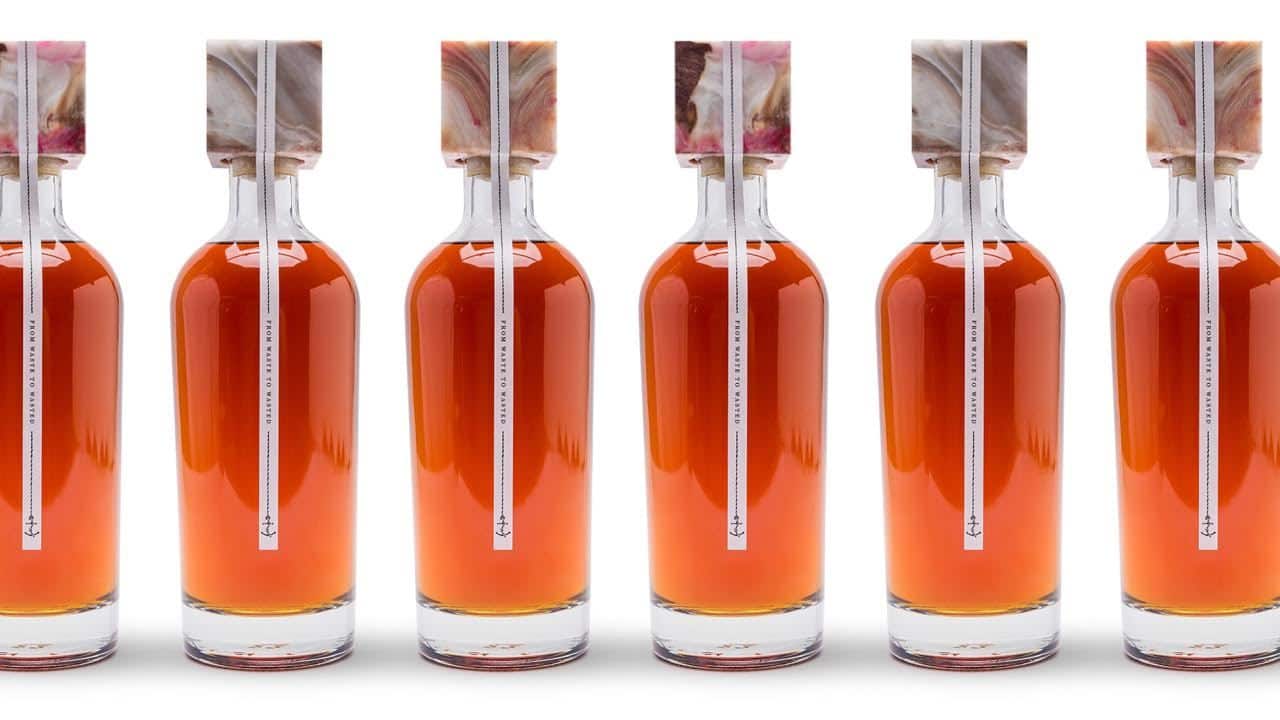
We wrote recently about the damage excessive plastic packaging is doing to the environment and couldn’t resist adding this little story of how Navy Rum brand, Fitzroy turned waste from the North Sea into labelling on their bottles. They decided to recycle the huge number of red Coca-Cola wrappers that were polluting the North Sea by melting and pressing them into bottle tops – okay, not quite graphic design, but an indicator that in 2018 designers are likely to be working with ideas and designs for brands wanting to create more sustainable packaging.
Audi are one of the big names that made a subtle change to their logo design in 2017, flattening the famous Audi rings, making them black and ditching the word ‘Audi’. Like Apple and Nike, Audi have proved that they have a strong brand icon that needs no words for it to be recognisable.
It’s a well known fact that your brand has to fight to be seen in a world flooded with advertising both on and off our screens. It’s time to differentiate yourself to get noticed. This means riskier concepts, bold choices in colour schemes, better social media images, bold fonts and more. To do this you need the help of top class graphic designers who know their stuff.
Of course if it’s printed bags you are looking at redesigning we have a very talented design team here at The Printed Bag Shop, on hand to help you create the ideal design for your bags that will be in keeping with current trends and reflect your business and the needs of your customers.
Why not get in touch today?
References:

