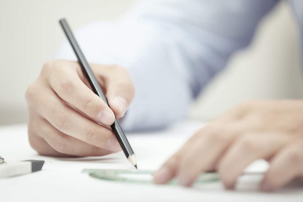
As a brand, the value of an effective logo design cannot be underestimated; a logo expresses who you are, what you do and what your story is in a single look. Having a fantastic, iconic logo is also vital for producing printed bags that actually work in promoting your brand. We can help you refine the artwork for your printed products, but having a logo that you can rely on to represent your brand is the most important thing for creating a great design.
Here’s 10 quickfire tips on designing a logo:
- Use a visual tool to make your customers think: can be tricky to develop, but creating a symbol that appears to be one thing, but is really another, is a great way of combining your product with the ethos you are trying to express.
- Choosing the right colour is extremely important: when selecting a colour scheme for your branding, think about the tone and personality of your business and which colour would be best to express that.
- Make it original: in logo design, as in fashion, trends come and go. Before creating your logo, do a little research into what competitors’ logos are like. If you spot a common factor, don’t rule it out altogether, but think of a way of transforming it into something original to help your brand stand out.
- Make it recognisable as yours: of course, the point of any logo is to be recognisable, but there are some companies that do this better than others, e.g. the bite out of the Apple logo, or the signature use of primary colours in the Google logo that mean we recognise it simply from the colours themselves, even when the name isn’t present.
- Customising your font: There are many, many fonts in the world, but it’s easy to use one we are all familiar with on your logo. By taking the time to develop your own personal style of lettering, you can make your logo more unique as well as recognisable, wherever you use it.
- Keeping it simple: Some of the world’s biggest brands (Nike, Apple, Adidas) have the simplest logos. The more complicated the symbol you use in your logo, the more your customers need to do to understand and the less chance they have of remembering it. Think – what is the one icon that expresses your brand?
- Consider symmetry: somewhat of a contradiction to the last point, sometimes a logo that looks basic actually has actually had a lot of thought put into it concerning the proportions and symmetry. Logos are about making an instant impression, and if there’s something not quite visually right about yours, it could seriously damage how well people remember it.
- Space is still important: what your customers can’t see on your logo is almost as effective on what they can; a logo doesn’t need to be cluttered and full of colour to be memorable; sometimes it’s the use of white space that can make the biggest impact.
- Make it look active: It may be subtle, but the difference between a logo looking static and active can really affect how your customers see your brand. A great example is the new Twitter logo; over the years it has transformed from a perched bird to one about to take flight, inspiring a sense of adventure in those who see it.
- Telling a story: Pretty images and fonts are all well and good, but count for nothing if they don’t represent the story behind your company. Conveying a meaning through a logo is difficult, but putting some time into generating ideas and possible ways of symbolising them before going straight in to the design process is a great place to start.
There you have it; 10 top tips on creating a logo!
Once you have a final logo design, come and talk to us to find out how to bring it to life. A great logo deserves to be shared, and printed bags are a fantastic way to do just that. To find out more, call us on 0191 268 7555, or email sales@theprintedbagshop.co.uk.
Read more:


